Hello internet. So I decided to go out of my way and present you a little "step by step" break down of this year's Us versus Them x Coachella 2016 collaborative festival print. I always find it interesting seeing how other indiviusals work leading up to the final result. So I figured way not give it a try on one of my favorite projects of the year. Hopefully someone finds this shit useful OR gets some sort of answer to their questions… Anyhow, please bear with me.
THUMBNAIL / CONCEPT SKETCH: When I got approached to do this years poster again, I couldn't help but bring back a few elements from last year's poster that I felt might help tie in a recruiting story/theme as a series of posters to come. So I brought back the turtle. This time chillin in an abandon pool in the middle of the desert. Festival in the horizon with your traditional Coachella Valley mountain range. Top Rocker "Coachella" hand drawn type blended in as part of the clouds to frame the whole idea in. This sketch was probably the size of my palm and drawn within a matter of minutes while the concept was still fresh in my head. I then scanned the sketch concept and emailed out for approval before digging any deeper into the project.
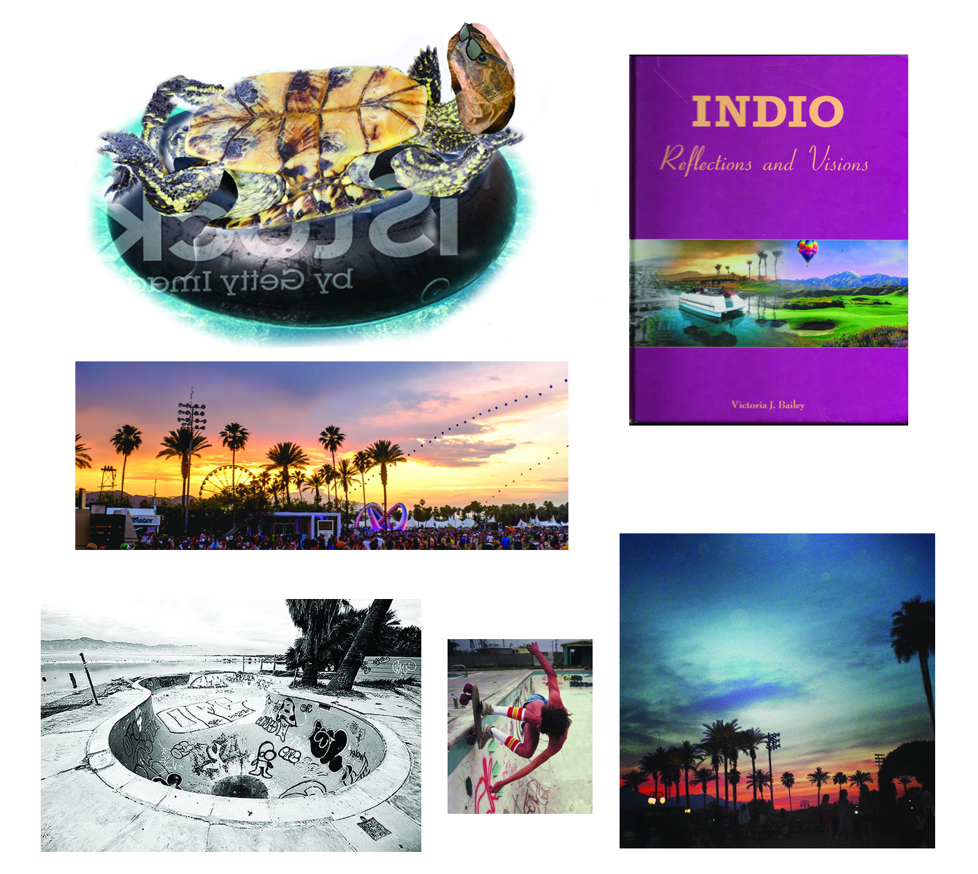
PHOTOSHOP / REFERENCE: Once I got word of the approval. I started to dig further for some more inspiration and reference. Off the bat, I started to photoshop a half-ass turtle in an inner tube as part of the center focal point in the empty pool. Pictured below is my brutal PS reference that I quickly put together of the turtle (Don't Laugh). I also started scouting for more material that's related to the mood or topic of the Coachella Valley or city of Indio. Luckliy I was fortunate enough to find a hardcover book that focuses on the history and origins of the city of indio. Below is a small pool of imagery that helped inspire this years collaborative print.
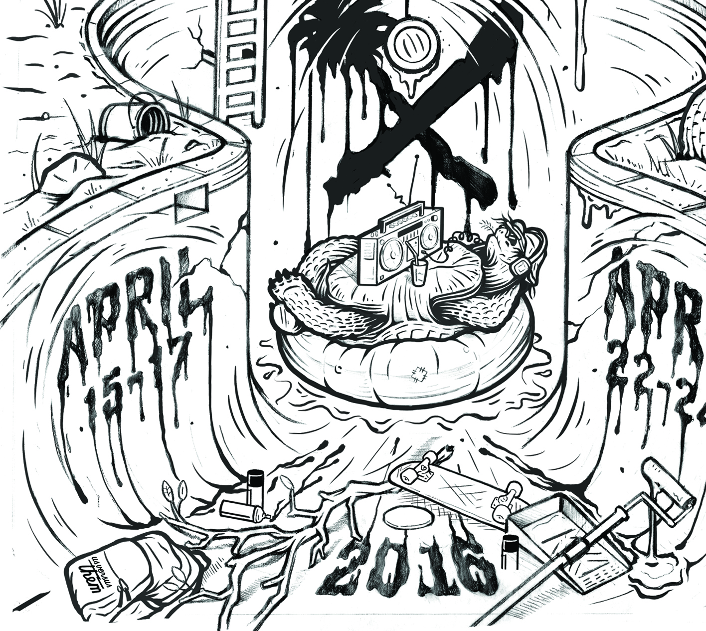
FINAL PENCIL SKETCH: A larger and tighter, rendered pencil sketch is then created which will later acted as a template to ink and trace. A lot of the times depending on the complexity of the concept, I'll blow up and tile together the original "palm sized" thumbnail and use that to lay down a super rough and basic outline of the final pencil sketch as shown below.
INKING: Once the final pencil sketch is complete, I then use it to trace by laying in the black ink on bristol paper over a light table. Probably one of my personal favorite parts of the process other then seeing the final poster itself. Once fully inked, the original inking goes to kinkos to get scanned on a over-sized scanner for digital prep.
CONVERT TO VECTOR / COLOR BLOCKING: Once the inked original has been completed and scanned. Open in PS and boost the levels to a complete black and white, create a work path and export to illustrator. Once exported, I select everything and give it a bright stroke (Green) to make all vectored paths viewable. After that I have the ability to start filling all the vectored paths as a solid fill (black) and getting rid of the bright stroke while leaving you with a completed vectored version of your inked original.
After that a lot of schemes and color blocking starts to take place. Decided to play with a nature desert "sunset" pallet. Figuered the magentas and cool blues would help give it that vibe.
HALFTONES: One thing I wanted to take advantage from the print was the use of colors and stretching it out to it's fullest potential. So I began to play with the magentas and cool blues as a halftone gradient for a sunset desert vibe for the sky. By halftoning, this allows you to cheat yourself with a secondary color to the original swatch allowing it to still serve as one color instead of two. I applied the same effect for the landscape as well which the final result came to a trippy gradient effect. Couldn't be happier with the results.
FINAL PRODUCT: Once the poster is complete and the artwork has been double checked, I then prepare the poster for print by calling out the pantones and sizing up the art to actual size (Remember to turn ALL type into outlines unless you want to hear back from your printer). When the posters are finally printed and sorted out, I then made a quick trip outside of LA to Inhouse Stickers in Chino Hills to sign and number my life away (Not so favorite part).
And of course... The FINAL print. These screen printed limited edition posters are an edition of 100 only (signed and numbered) and will be exclusivly avialable at the Coachella Music and arts festival this April. If your lucky you'll get one since i'm more then positive these will SELL OUT. Unless you have the paper to jump on ebay well after the festival and spend a pretty penny...
That about wraps it up. Hopfully this quick breakdown gives you some sort of light with my design process for this years gig poster. See you guys at the polo fields!
-Victor Koast


